Molokiya.
Warmth and calmness in the new yogurt packaging.
Client: Molokiya
Location: Ukraine
Year: 2019
Activities: packaging design, visual identity, art direction.
Featured in: Packaging Design Award
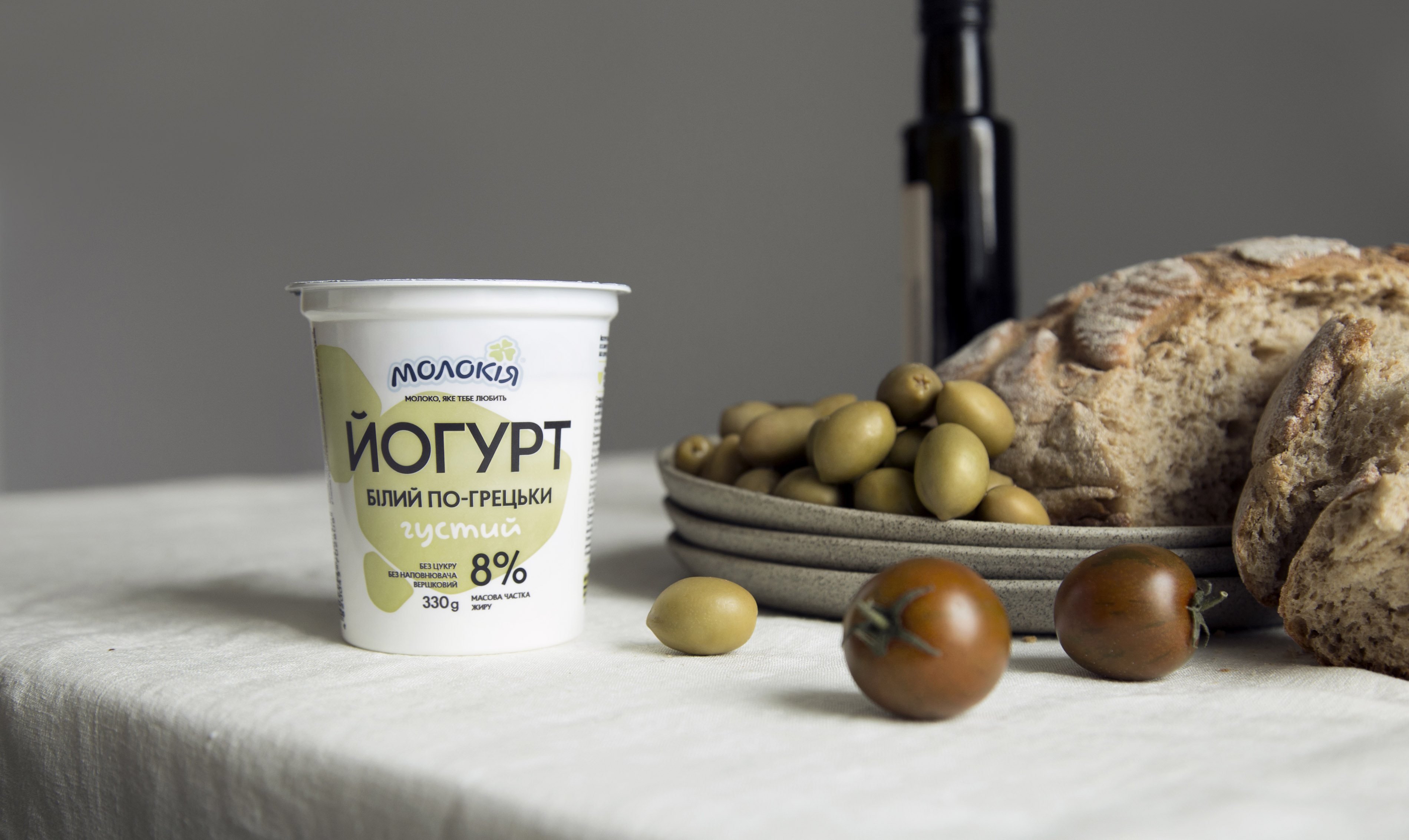
Molokiya is one of the biggest players on Ukrainian dairy market that has taken care of Ukrainians’ health for more than 20 years producing healthy dairy products. Molokija is a brand that shows dynamic development and offers customers many new products that meet present needs of the young audience.
At a time when more people pay special attention to nutrition bothering about healthy ration, Molokiya brand launches a new product for Ukrainian market – a line of white yogurts without fillings. They are perfect for both cooking dishes and consuming separately.
Exploring consumers’ needs we realized that in conditions of fast rhythms people require balance and time to enjoy food. Calm and steady food consumption becomes a special ceremony amidst stormy life and helps products to assimilate well.
Designing packaging for yogurts became a rethinking of our 2016 solution. Having rejected all excess we gave more warmth and calmness to the brand telling about its naturalness. These values have become decisive in forming the new mood of the brand.
We transformed ideal shapes of drops into more loose and natural outlines. Painted in light shades as colored with milk they added a feeling of naturalness. Typography became a collective element in packaging design and added more simplicity and clearness to the product.
Relaxation and calmness – it is the mood in which we recommend to enjoy favorite Greek or classical Plain.


-
 DoneDoneReimagining identity for a player in the logistics and finance sector
 -
 Blast Out StudioBlast Out StudioVisual identity for a Ukrainian sustainable fashion brand
 -
 Barvinskyi Art GalleryBarvinskyi Art GalleryA new chapter in Vienna's art scene
 -
 Raw Records ResearchRaw Records ResearchNaming and visual image for urban improvisations