Kazakhstan Premium Beer.
Kazakh sun in the new can.
Client: Pivzavod #1
Location: Kazakhstan
Year: 2016
Activities: packaging design
Merits: Blog Esprit Design, We and the color
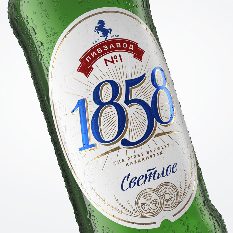
We have created a new package concept for Kazakh premium beer “Pivzavod No.1”. The goal of package redesign was to bind national identity and create modern European design at the same time. One of fundamental decisions was to leave aside the name “Pivzavod No.1” and use only foundation date and beer style in communication.
The key element of communication is a simple and clear symbol – the sun, which is an element of Kazakh national flag. It creates a range of important associations with warmth, ripe hops and golden shade of beer. The sun was placed on nominal horizon dividing the can in half. In the lower part of the can, styles of beer are placed which are additionally differentiated by colors close to Kazakh culture. Premium status and the highest quality of the beer are certified by an elegant signature of the brewery owner.
Typography owing to pronounced triangular serif typeface nicely matches the graphics of sunrays. Thus, two main identifiers: the logo and typography work as one and create strong and precise brand image.


