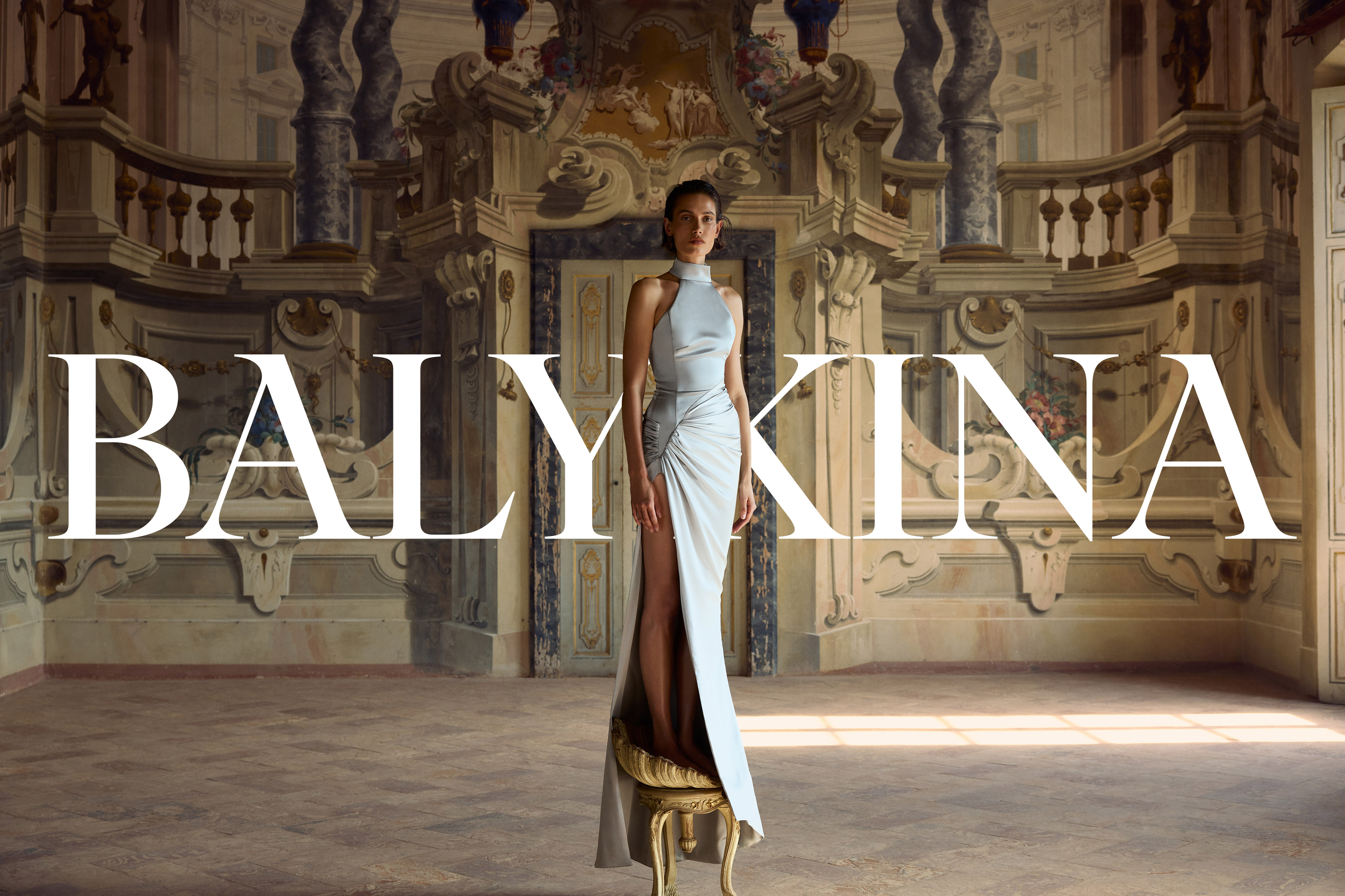
Balykina.
Brand identity for a sculptural fashion brand.
Balykina.
Brand identity for a sculptural fashion brand.
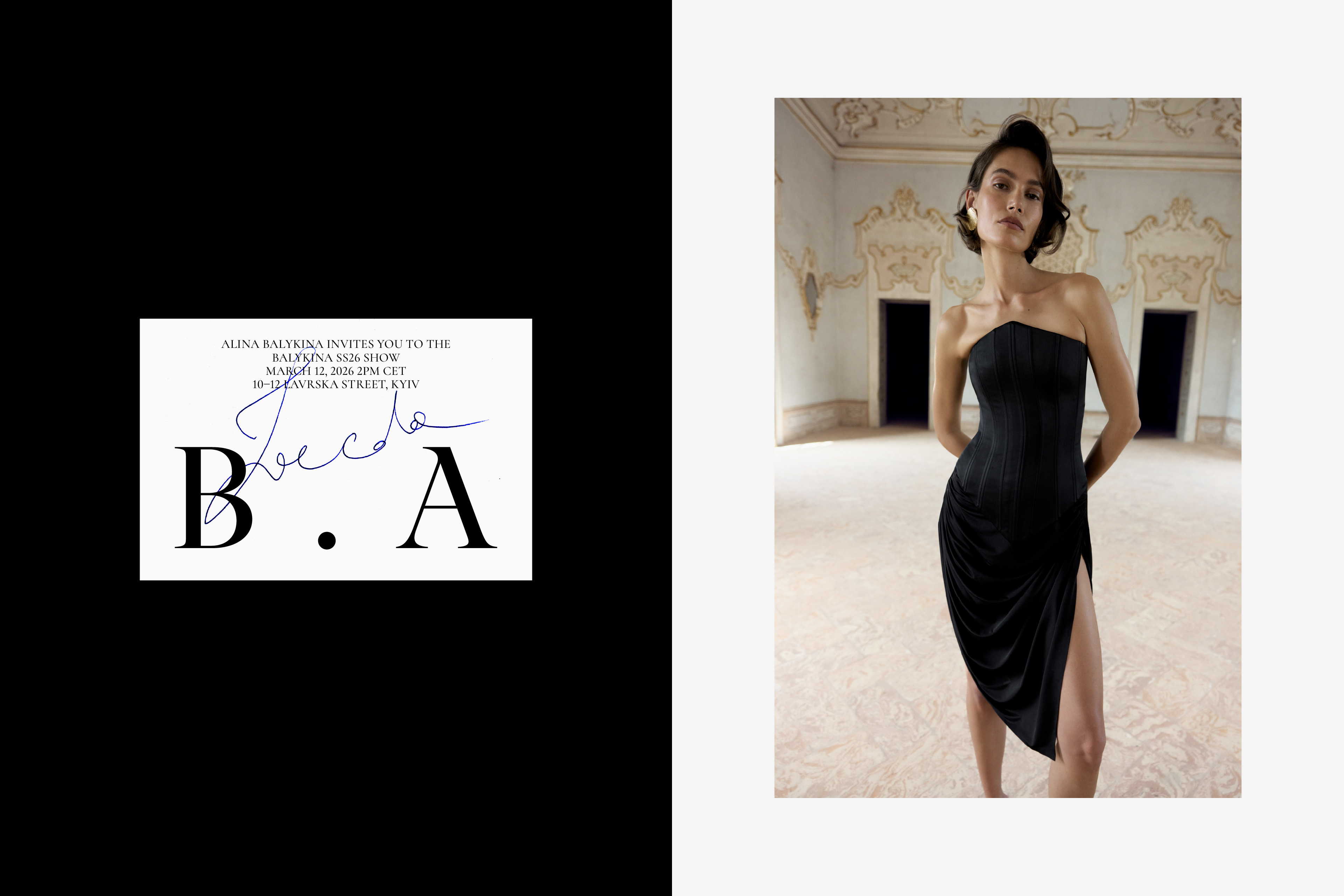
Client: Balykina
Location: Ukraine
Category: Fashion
Year: 2026
Activities: Logotype, symbol, visual identity, brand materials, brand guidelines.
Images: Courtesy of Balykina
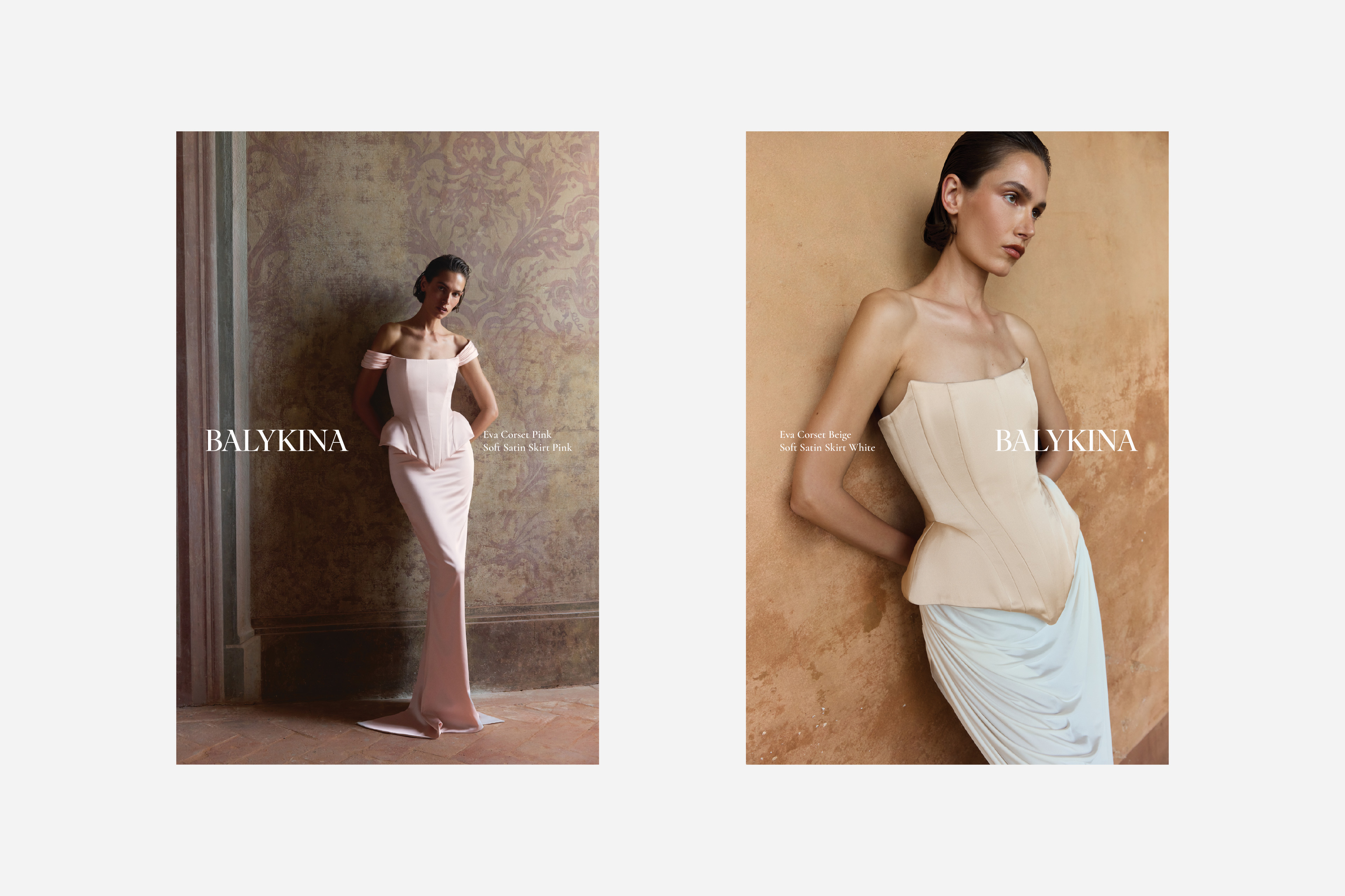
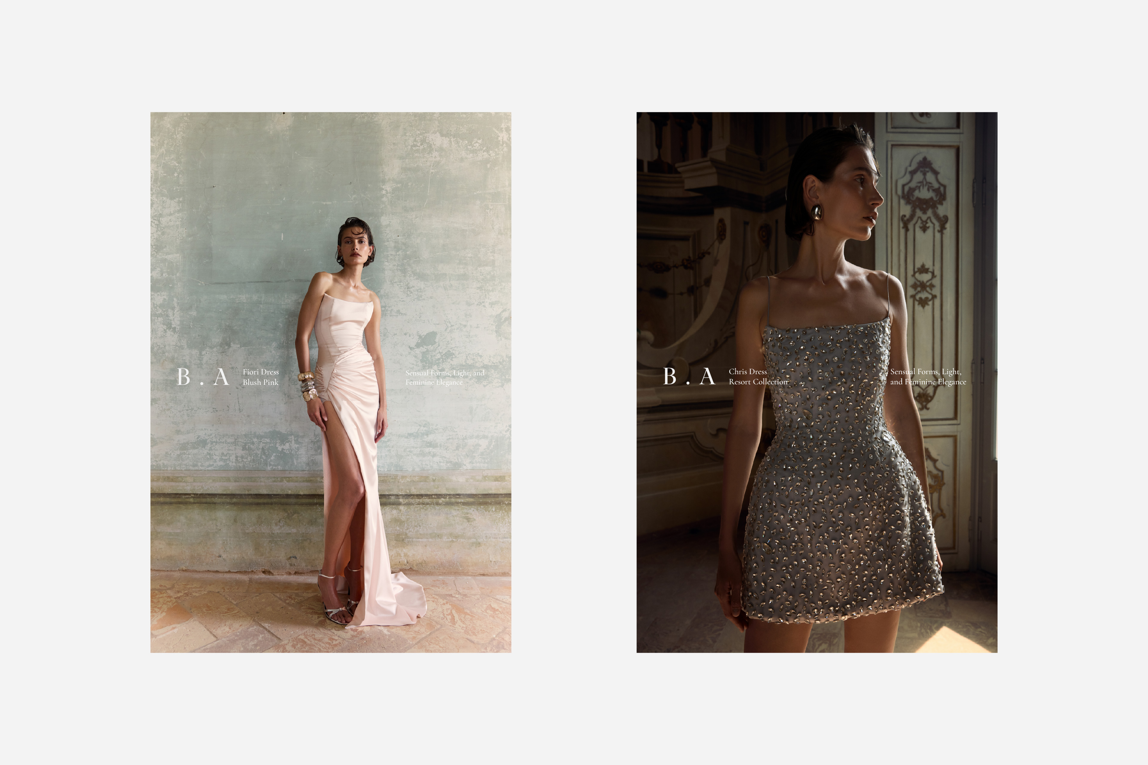
Balykina is a womenswear brand specializing in eveningwear, known for its transformative and sculptural approach to tailoring.
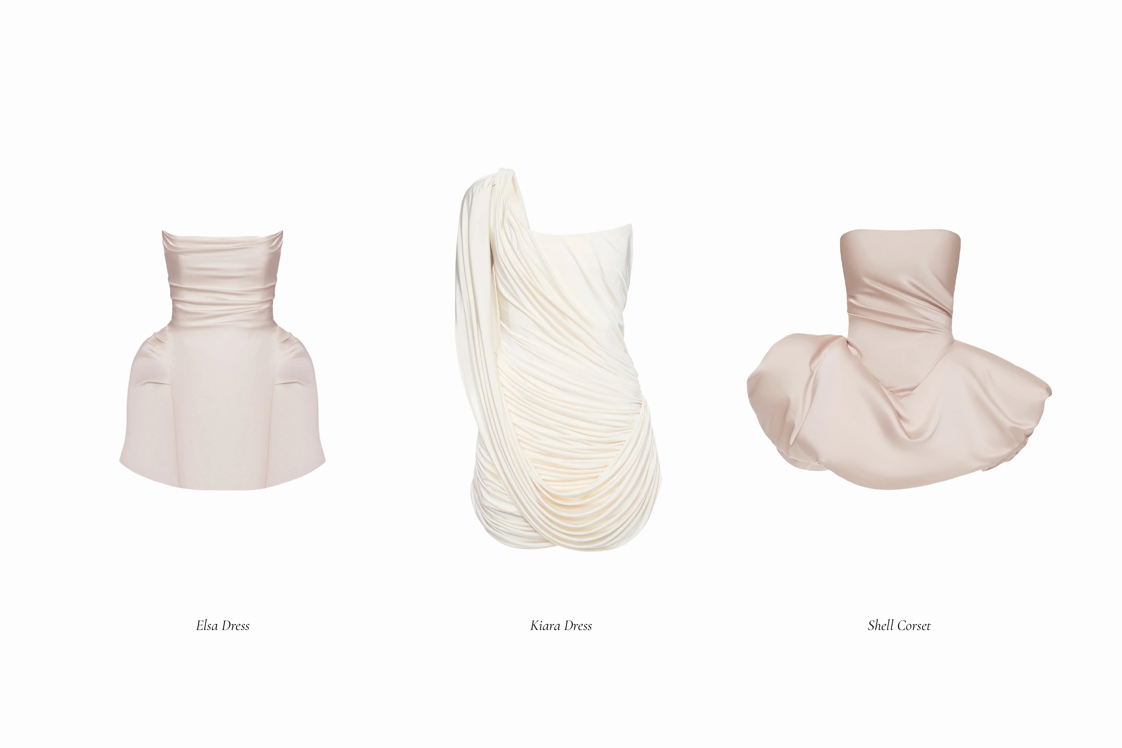
Inspired by timeless elegance and the glamour of old Hollywood, the brand works with corsets and corset dresses as a language of freedom, strength, and sensuality. Through a strong focus on proportion and construction, BALYKINA emphasizes the natural curves of the female form, creating iconic silhouettes with a distinct character.
Our task was to develop a brand identity system that reflects BALYKINA’s core values — elegance, strength, and femininity — while remaining contemporary, expressive, and adaptable across different collections and formats.
Concept
The key objective of the identity was to create a strong visual core that clearly communicates the character of BALYKINA and can scale effectively across various formats.
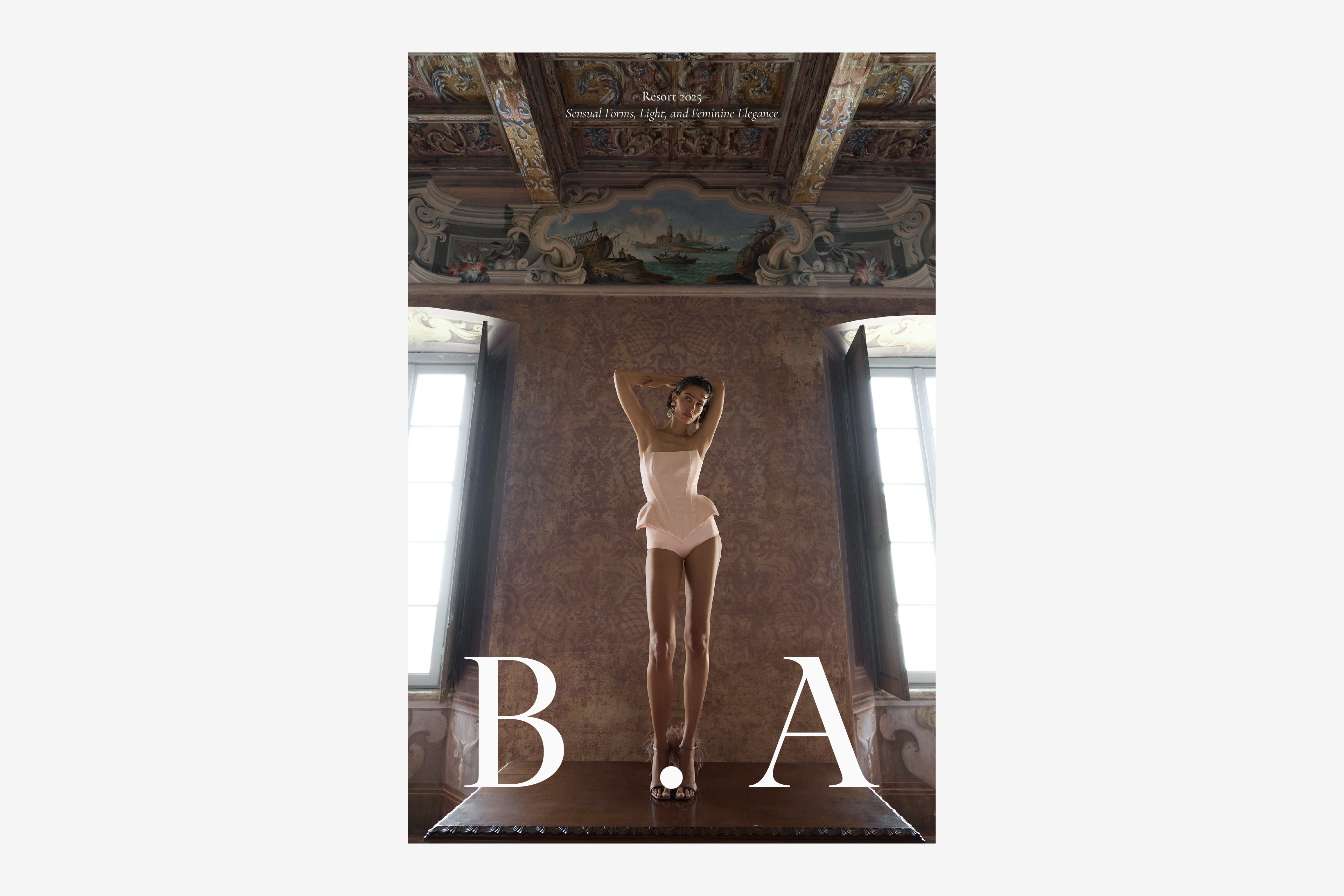
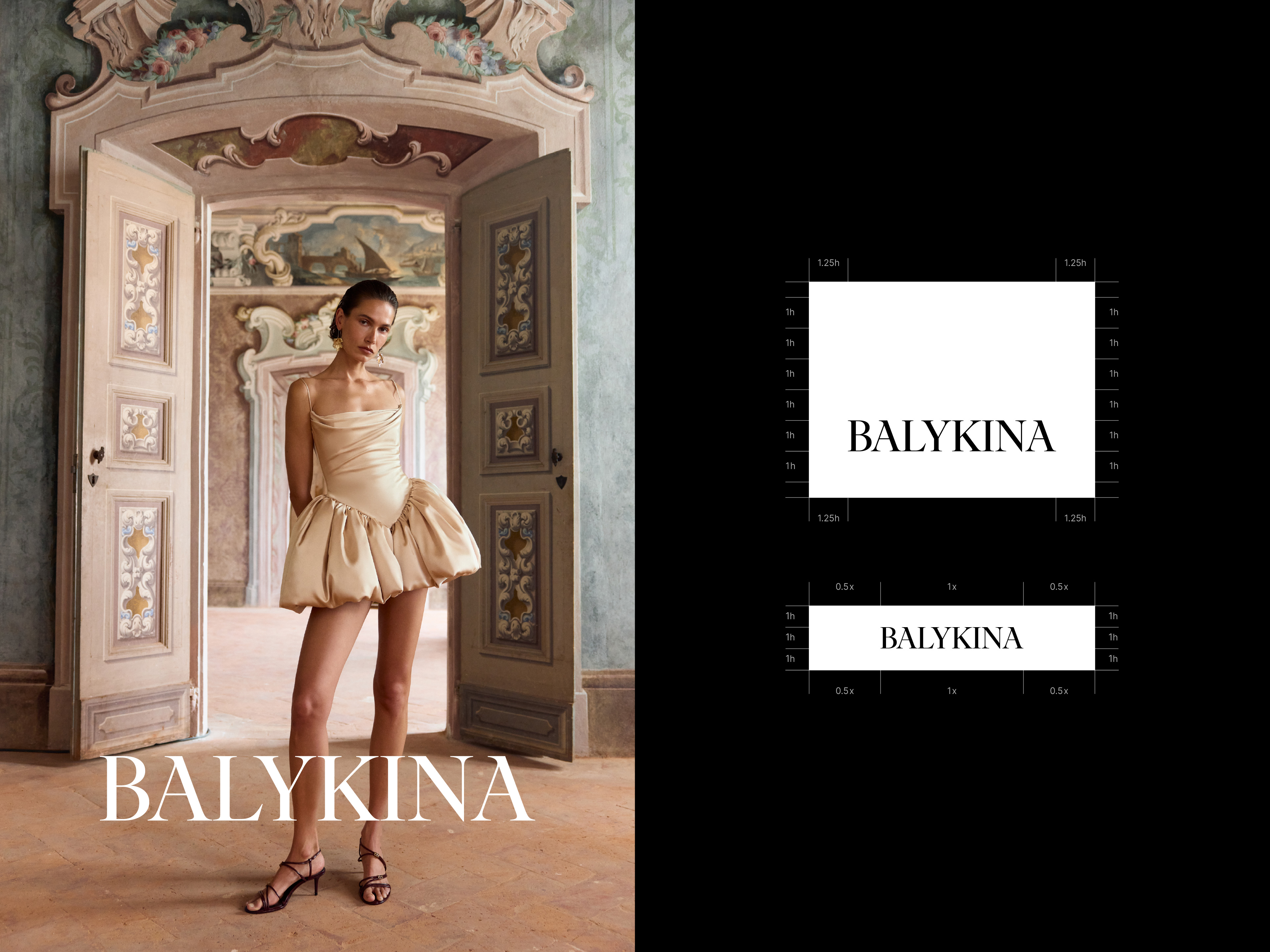
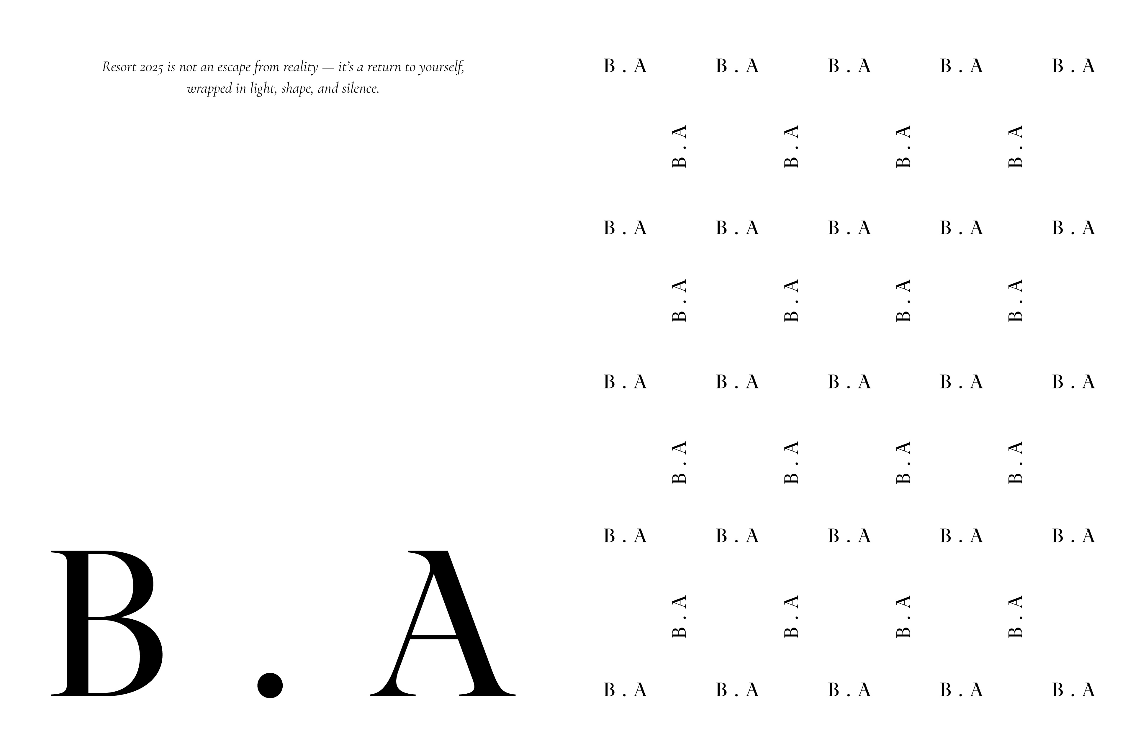
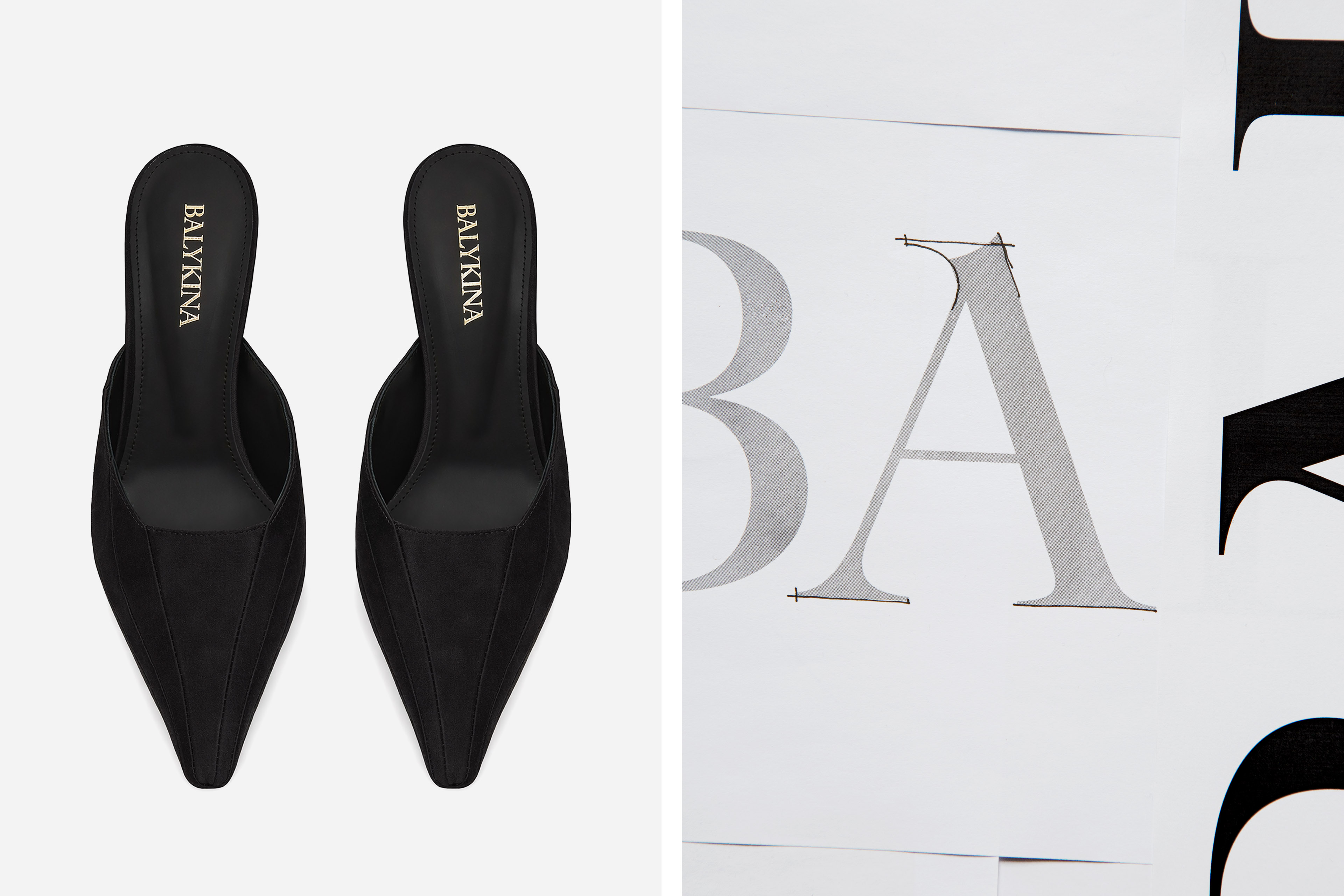
The logotype was developed as the primary visual anchor of the brand. Elegant and contrasting, it conveys BALYKINA’s character through refined proportions and distinctive details. The pointed peaks of the letter “A” introduce a sense of quiet tension, referencing the sculptural nature of corsetry and the brand’s dramatic silhouettes.
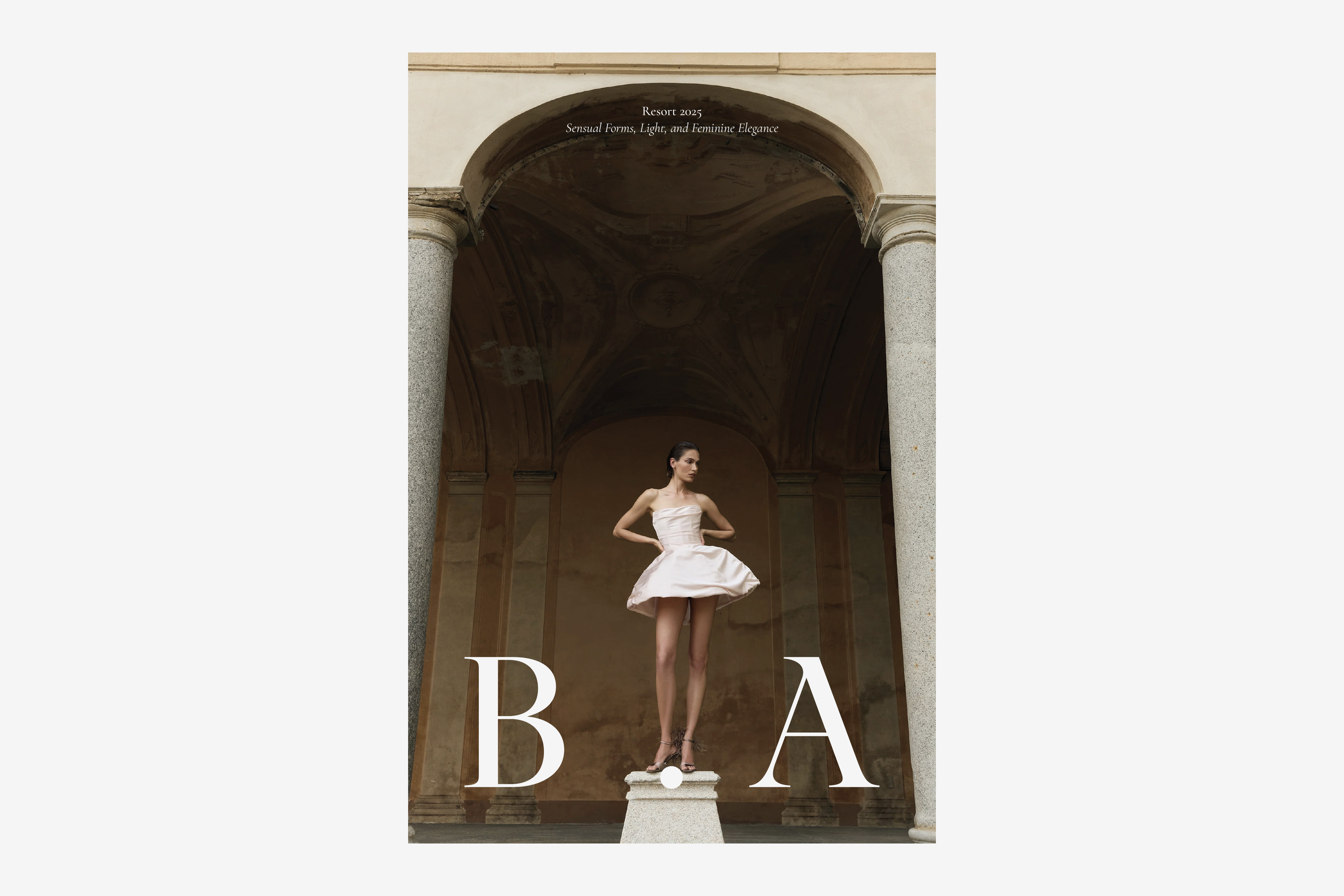
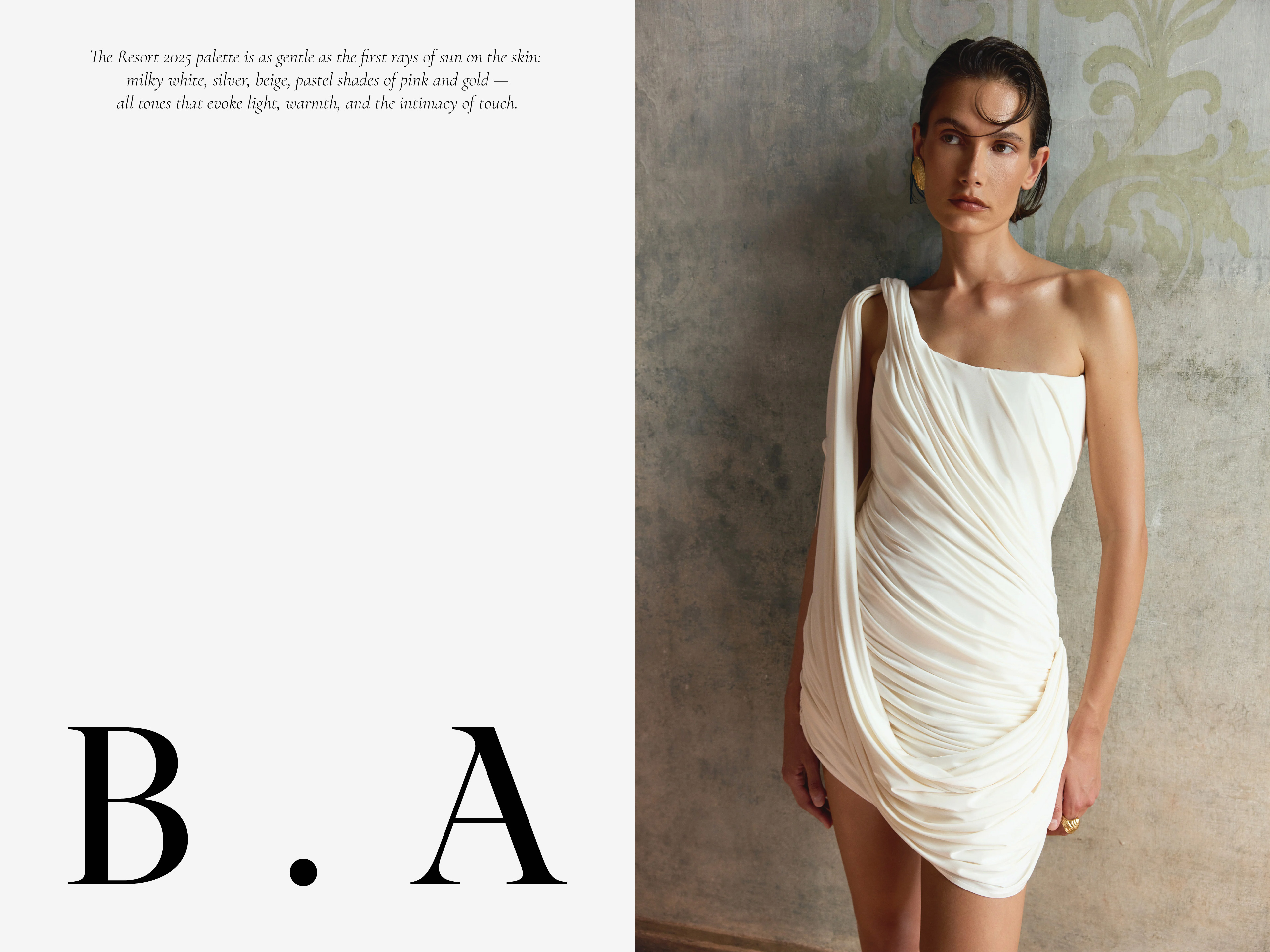
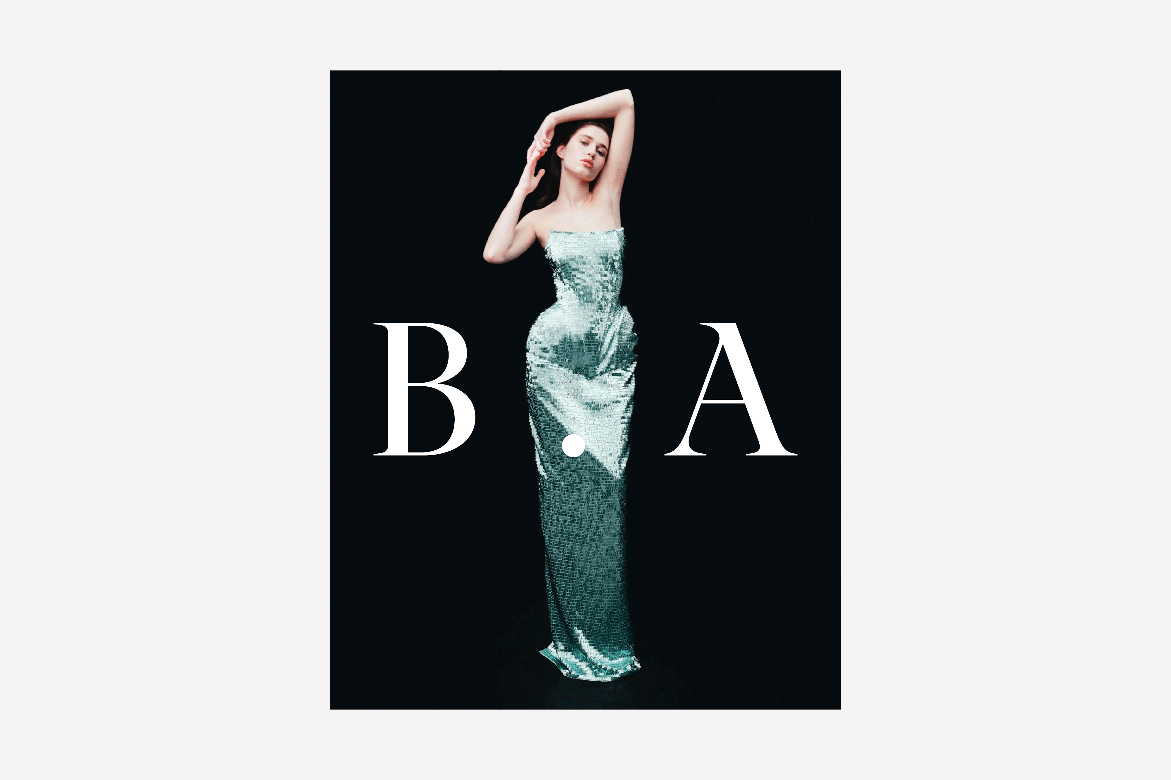
At larger scales, the B · A mark visually opens up space at the center of the composition, creating the impression that the letters step aside to make room for the image. The central dot acts as an anchoring element, holding the abbreviation together as a unified whole and maintaining visual balance. This effect of scale allows the mark to support the image rather than compete with it, working as a frame and visual foundation for the model.
The symbol is built around the letters B · A, which represent both the first and last letters of the brand name as well as the initials of the founder and creative director, Alina Balykina. This dual meaning emphasizes the personal authorship behind the brand and results in a mature, recognizable mark. As a secondary identification element, the symbol reinforces the brand’s character, performs consistently across different scales, and reads as a personal signature of the creative director — two capital letters separated by a dot, easily reproducible by hand.
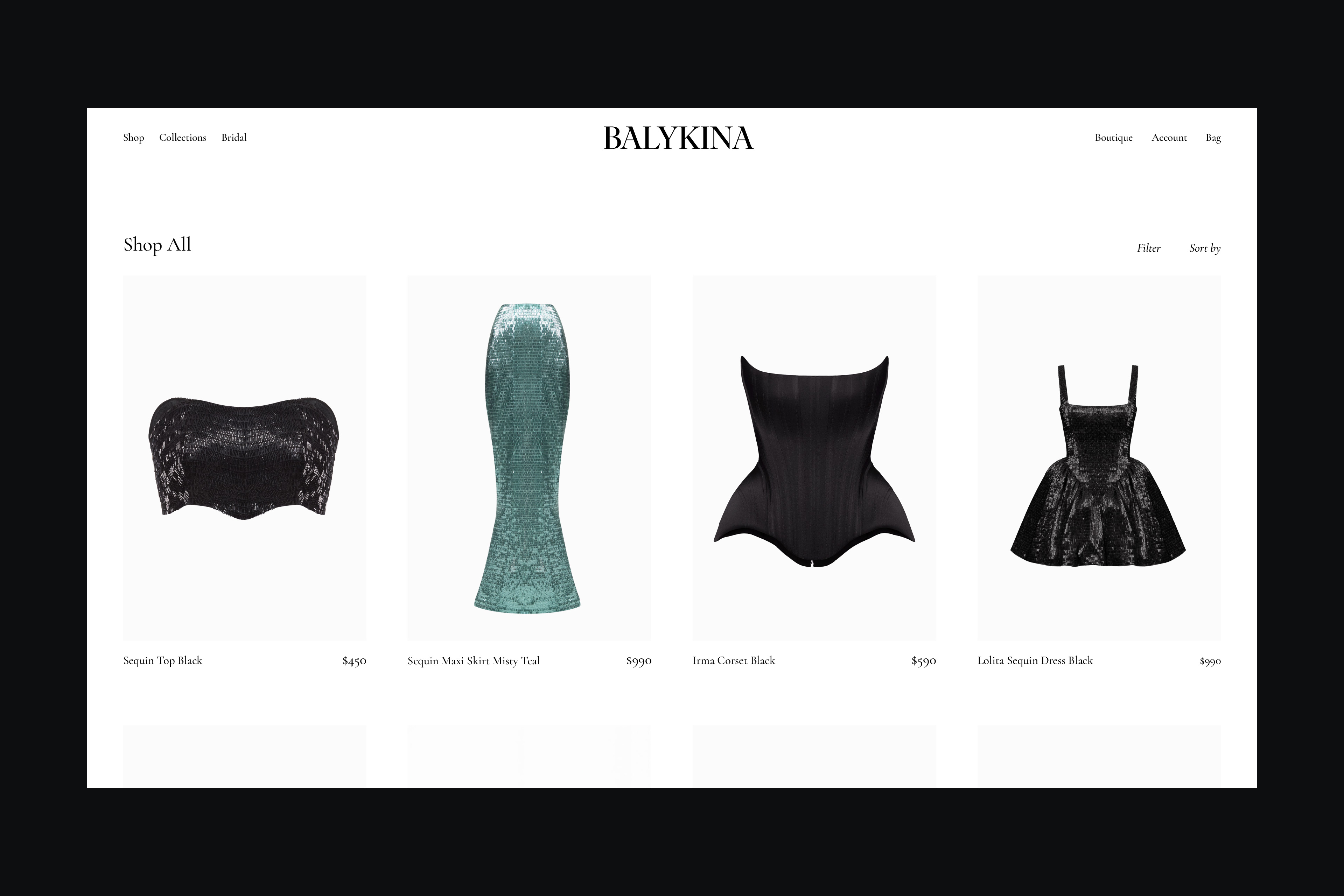
Visual System
The identity system was designed to be flexible yet controlled — capable of adapting to seasonal collections while maintaining strong brand recognition. Typography and compositional rules reinforce the brand’s character, allowing the garments themselves to remain at the center of attention.
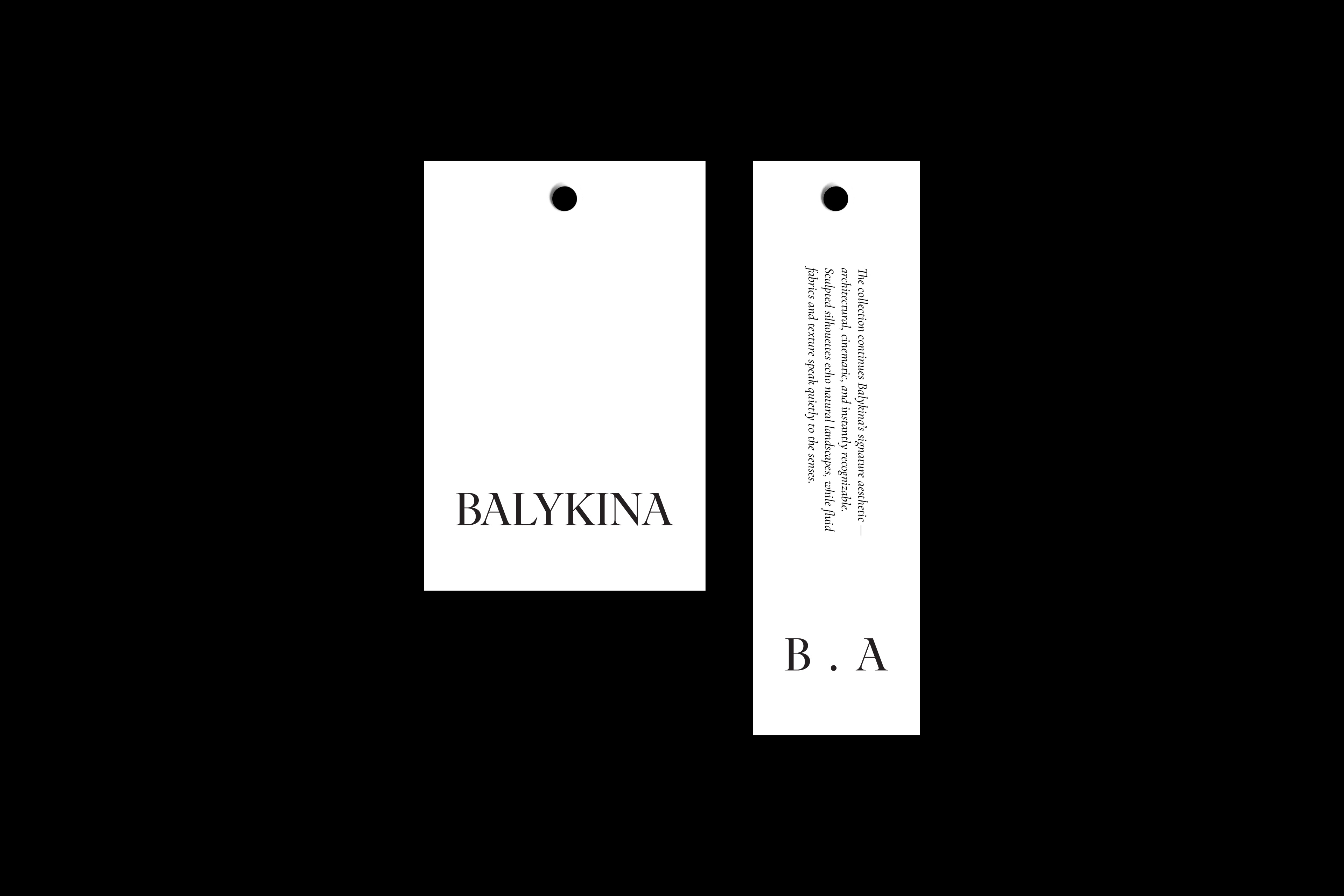
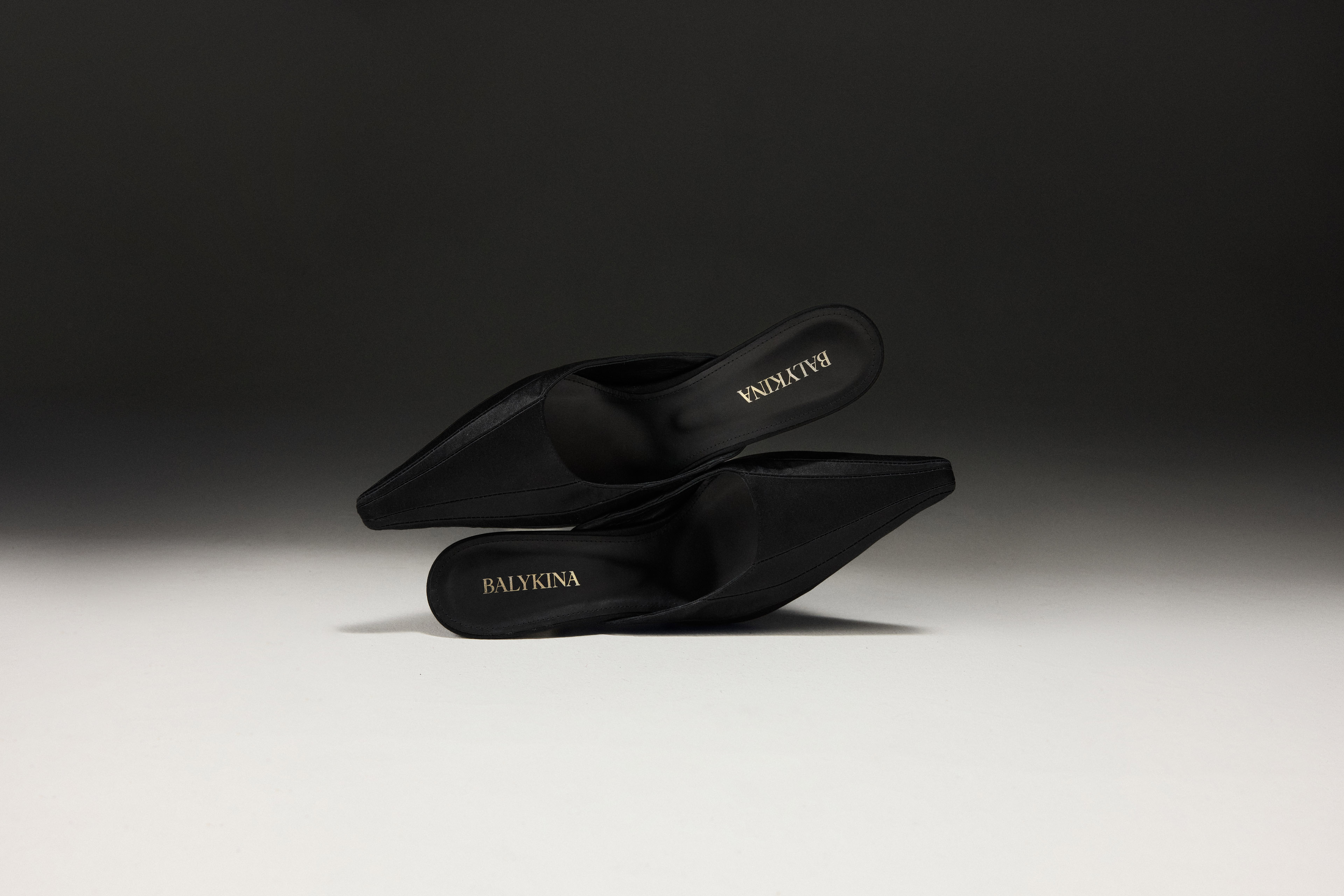
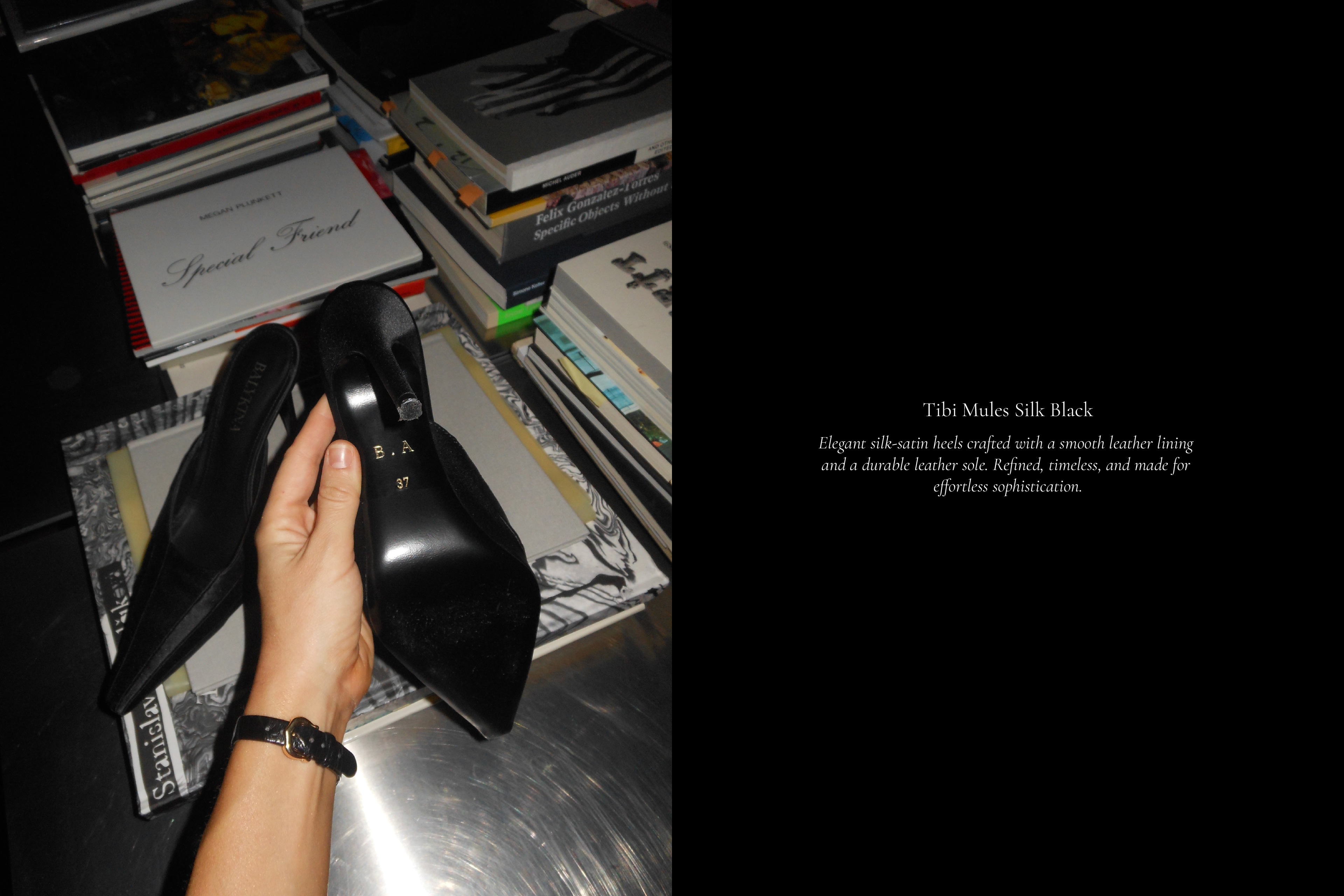
The developed identity was implemented across a full range of brand materials, including labels and hang tags, packaging and shopping bags, brand guidelines, and communication materials. Each element was designed as part of a cohesive system, ensuring consistency across BALYKINA’s main collections and bridal line.
Result
The final identity positions BALYKINA as a confident, contemporary fashion brand with a clearly defined aesthetic stance. It supports the brand’s sculptural language, highlights its attention to proportion and detail, and provides a solid visual foundation for further development across collections and markets.