OM No Rest Fest.
Fiery rhythms and purity of natural water in the new visual identity.
Client: OM No Rest Fest
Location: Republic of Moldova
Year: 2020
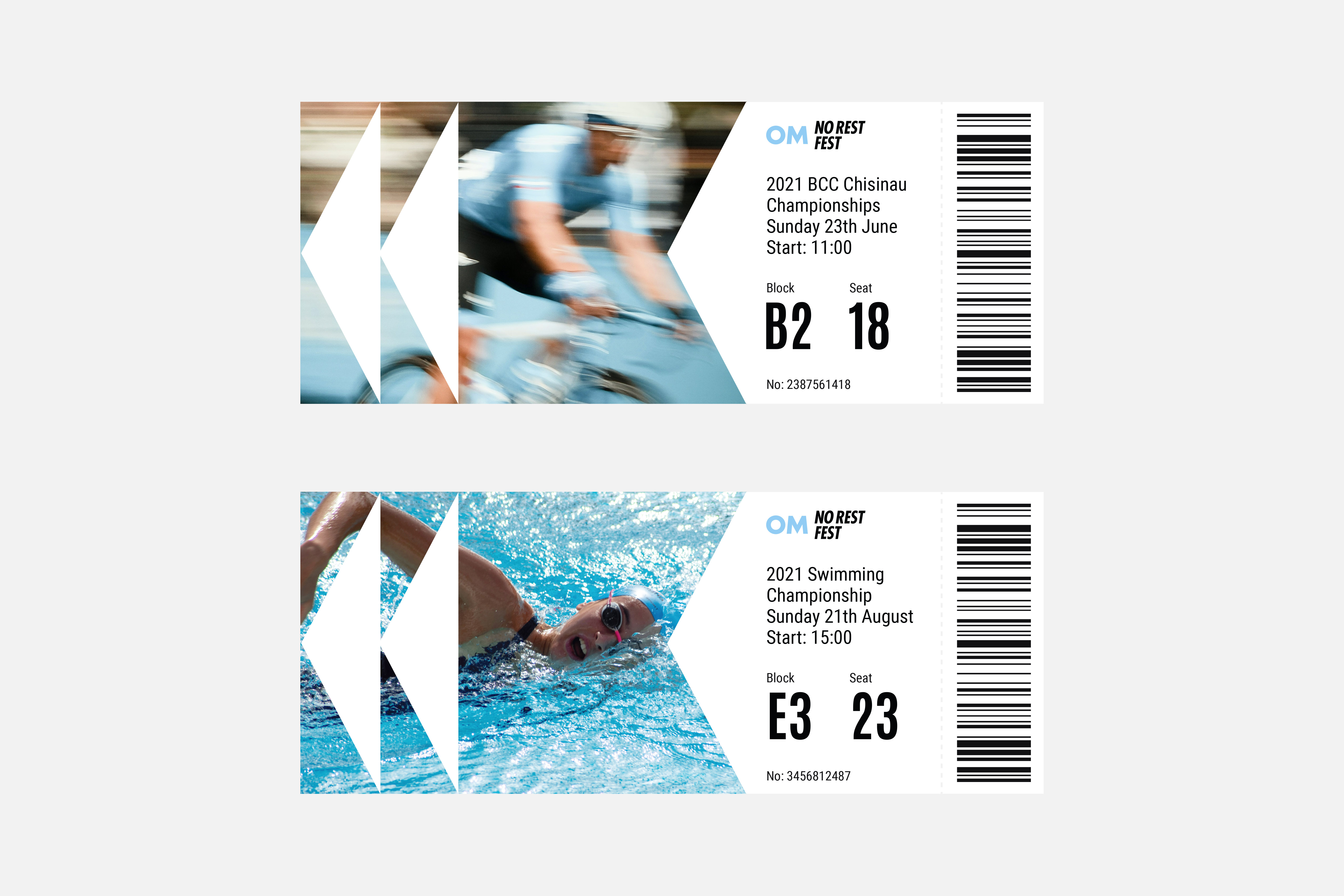
Activities: logotype, visual identity, interior branding, graphic design, communication materials template, guidelines
OM is one of the most recognizable brands of drinking water on the Moldovan market. The water has an optimal mineral composition for athletic performance and is perfect for people with an active lifestyle. The brand's philosophy has always been to grow and support the health of the population by promoting sports and developing a culture of healthy lifestyle. In addition to its educational projects, the OM brand is launching the largest sports festival OM No Rest Fest.
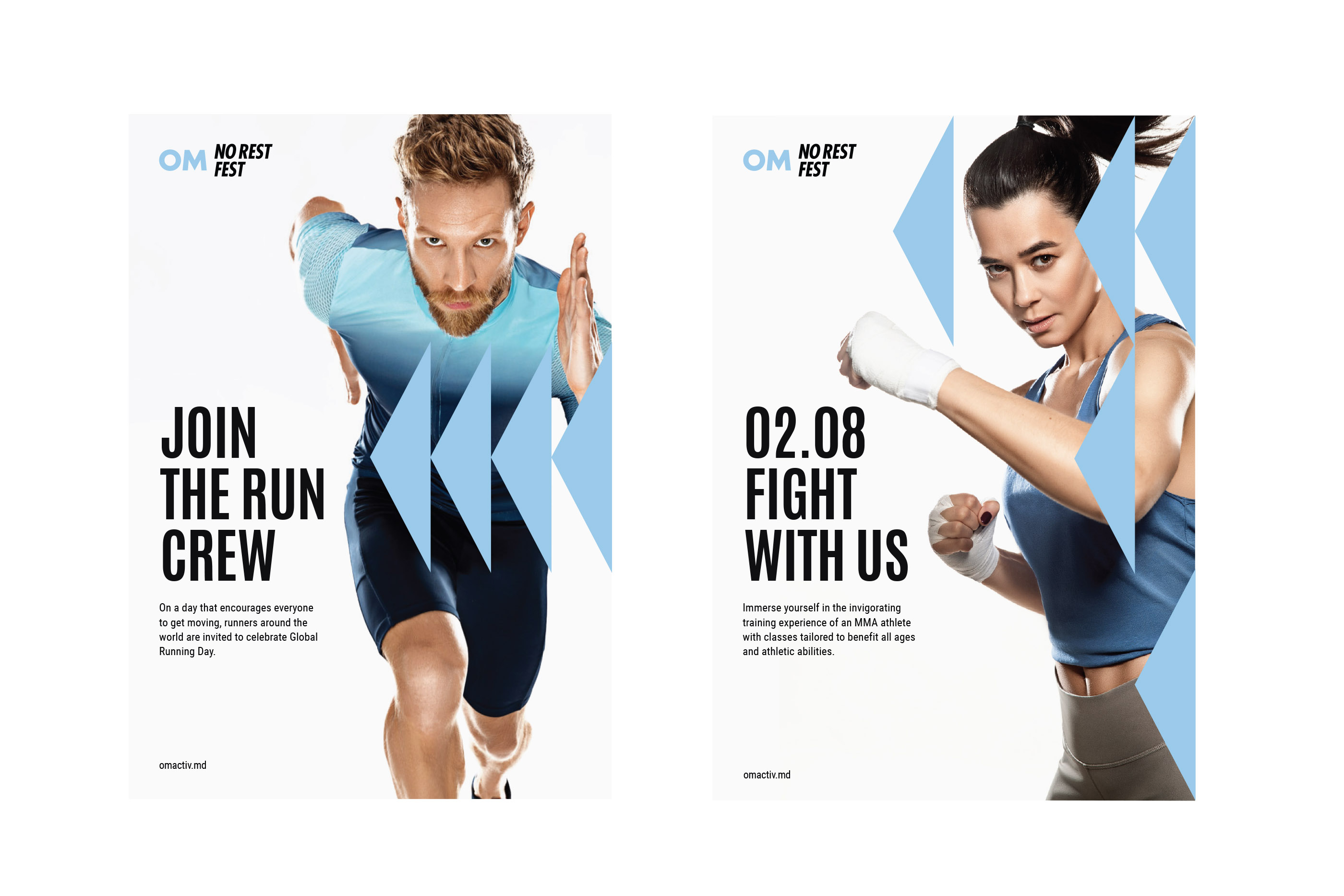
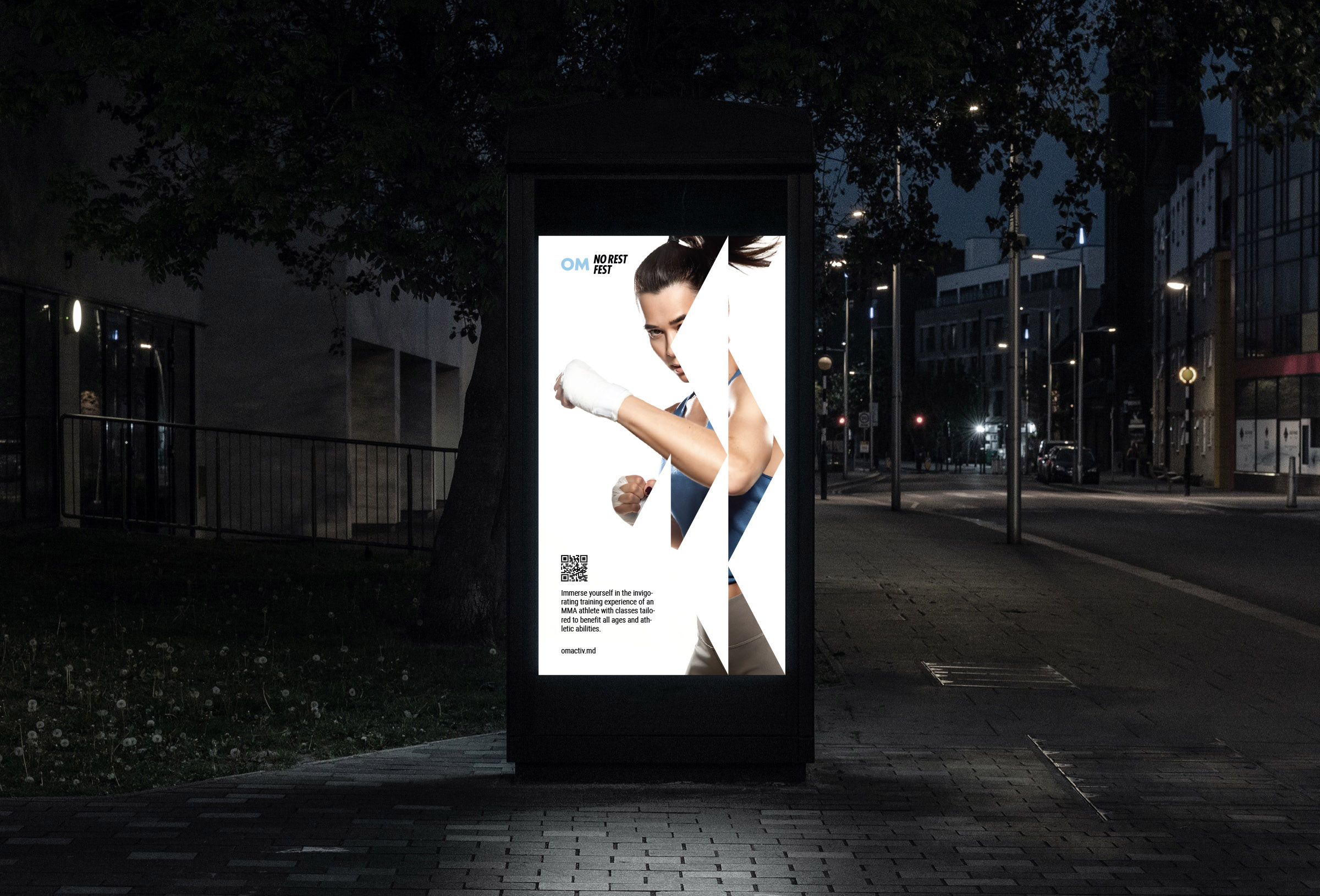
OM No Rest Fest is a complex of events and athletic competitions for all fans of sports, healthy recreation, and excitement! Whether you are a beginner, a professional or a dedicated fan, OM No Rest Fest has got you covered. There are multiple areas with various sports for everybody. Coaching from celebrity athletes, swimming, tennis, and cycling competitions, this is all OM No Rest Fest.
The festival needed an individual style and a visual language of communication, which would merge the sporty dynamic mood of the festival with the purity and lightness of OM natural water.
Molto Bureau developed the logo, identity and a visual language of communication of the festival. The new OM No Rest Fest visual style is both, the vitality and health of OM natural water, and the fiery and vigorous rhythms of the festival vibrations.