Beerophilia Club.
A key to the private club of beer aesthetes.
Client: Beerophilia Club
Location: Ukraine
Year: 2015
Activities: logo design, visual identity, brand guidelines; packaging design
Featured in: Dieline, BPO - Branding Packaging and Opinion, What the Pack, Packaging Of The World
Beerophilia is a new club with the aim to unite real beer lovers. These guys seem to know everything about beer.
You can learn at what temperature the bouquet of India Pale Weizen reveals best or why the orange French cheese Mimolette complements the taste of the Trappist beer Rochefort, etc. All these wisdoms are celebrated under a gastronomic cult.
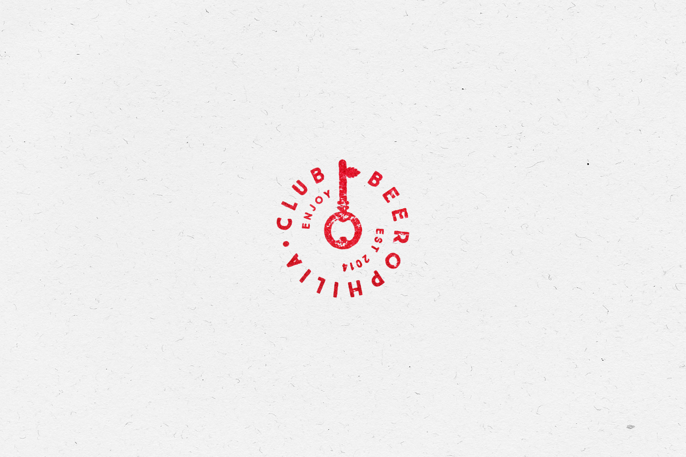
Our creative team has developed a logo in the form of a key symbolizing access for real beer lovers. The head of the key was designed like a bottle opener, while the key bit looks like a hop blossom.
To give the whole identity more natural look and feel, we decided to use only natural materials. All basic elements of the identity were handmade. And the logo has symbolic shape of a stamp.


-
 Buco Coffee ManufactureBuco CoffeeNight guardian of coffee beans
 -
 A44 Architecture & designA44Logo and identity for young and progressive studio
 -
 Kazakhstan Premium BeerKazakhstan BeerKazakh sun in the new can
 -
 Sophia Hotel KyivSophia Hotel KyivCreating the logotype and visual identity for the hotel in the heart of Kyiv